Redesigned Home Screen With Added Features
My Role: UX/UI Designer + Researcher
-

Before
-

After
-

Before
-

After
Why did I choose to redesign Infinite Campus?
The Infinite Campus is a cloud-based school management solution that caters to districts ranging from 30
to 330,000 students.
This project aims to make the app more intuitive and supportive of students who struggle with keeping up
with assignments due to special needs like ADHD. Moreover, having some added features for students
and parents to keep track of their progress will help students achieve their future goals.
The target audiences are students who struggle with keeping up with their assignments and parents who
struggle to give their kids reminders promptly.
Problem
How may we improve the app, so that it
remains simple yet more effective for
students?
Solution
Provide students with the tools necessary to
keep track of Assignments and upcoming
Tests, with a proper support system and
positive reinforcement.
Research
To understand the struggles of the users I used two research methods.
User 1:1 interviews
Competitive analysis
To understand how to improve INFINITE CAMPUS app, I decided to interview three major users of the app.
-

Students
-

Parents
-

Teachers
1. User 1:1 interview insights
The user interview was conducted with students of middle school, high school students, teachers and
parents were interviewed to understand their role and frustrations with the current infinite campus portal.I
also interviewed a College professor to understand the campus portal system of the college and explore
what features I can add to the existing infinite campus app.
-

Having the flexibility to turn on and off reminders according to the students's needs helps them stay more organized.
-

Positive encouraging quotes sound more authentic from a person you admire or know well.
-

High frequency of reminders can caused anxiety issues.
-

Students feel the need to communicate with their teacher while they are preparing for a test.
-

Making the reminders less mechanical and more humanized will help reduce the overall stress level of the students.
2. Infinite Campus Competitive Analysis
I compared the infinite campus app with the skyward app. I found the infinite campus app UI easier to navigate. I also studied some indirect competitor apps and made notes of some of their features I liked.
-

Strengths
Clean and easy to navigate.
Clear display of assignments and grades.
Notifications for students and parents with changes in grades and scores.
Class schedule.
Attendance updates.
Weaknesses
No option to customize notifications.
No option to set reminders.
No option to ask for help.
-

Strengths
Lunch Menu and Bus schedule available.
More Filters are available.
Basic information is available.
Weaknesses
Confusing UI
Too much information is displayed on one screen.
No information about due date.
Define
In order to make the best decisions about
design features it was essential to take a
step back and get a clear overview. I came
up with the student goals and defined the
student task breakup to have a clear view
of information architecture of the added
features.
Information architecture of added features
Ideate and Design
Based on the existing UI of Infinite campus
I added the reminder feature for students
with the flexibility of choosing time and
frequency. I also added a support feature
for the students for easy access to help
during homework and test prep.
Initial low fidelity screens
Initial screens of added features based on
existing UI of INFINITE CAMPUS students with
tools necessary to keep track of Assignments
and upcoming Tests, with proper support
system and positive reinforcement.
Final Screens of Added Features - Today and Assignments Final Screens
-

Home Screen
Student can see all the options clearly with pictures. I tried to use calm colors and made the home screen esthetic and more functional.
-

Today Screen
Student can view not only the class schedule for the current day but also can see the status of assignments for each subject. Positive quotes are added to today screen to encourage the students to try their best each day.
-

Assignment Screen
Students get a clear picture of their assignments. they can filter by subjects, current or missing assignments.
-

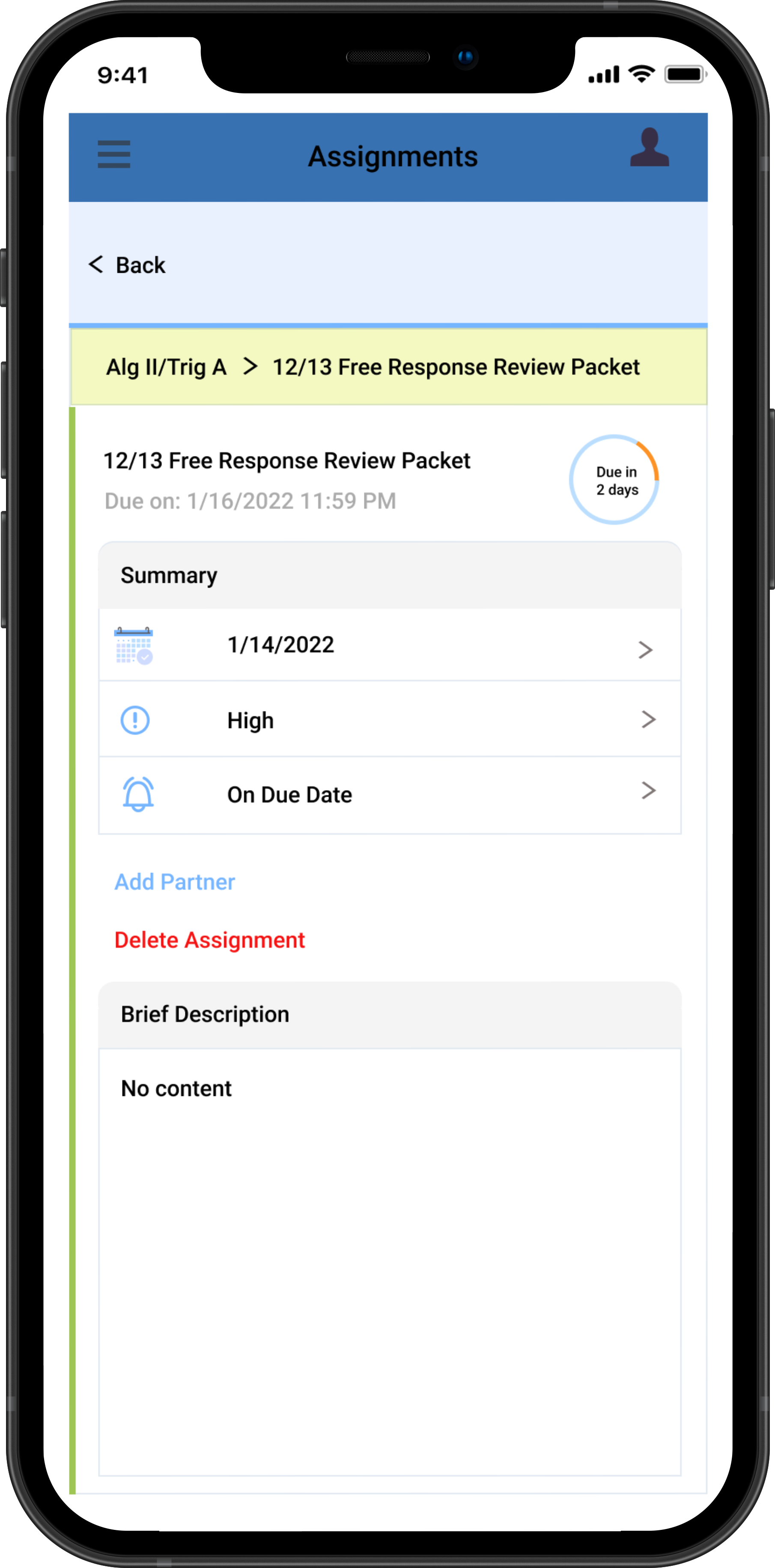
Individual Assignment Detail Screen
On clicking on an assignment the students gets due date, priority level and an option to set reminder. Student can also add description for each assignment.
-

Reminder Screen
Students can set reminders to finish a certain assignment.
-

Setting Reminder Screen
Reminder can be set for the due date or before due date.
Final Screens of Added Features - Today and Assignments Final Screens
-

Home Screen
Student selects the test tab to view upcoming tests.
-

Test Screen
Similar to assignment screen the tests can be filtered and sorted according to subjects, current or missing.
-

Selected Subject Test Screen
Similar to individual assignment screen. One added feature is the access of students to support system during test prep..
-

Support Screen
Students can either ping their teacher or student who have volunteered to help other students..
Conclusion
In the Edtech space, accessibility should be a must while designing apps and websites.
Positive encouraging quotes were highly appreciated by the educators, parents, and students.
Edtech's designs should be informative but not overwhelming.
I created two flows of prototype of two added features.
Check out the
prototype
of
added features!
Thank you!


